Tay Design - Where did it come from?
I have been listening to the Jamie T album “Theory of Whatever” a lot recently. In a radio interview, I remember hearing Jamie mention that he had forgotten that he wrote “The Old Style Raiders”, he found it on a laptop, and finished it and it was one of his favorites on the new record. It got me thinking, what designs have I started that I have forgotten about? So I raked through my sketchbook and design files. That’s how I remembered about Tay.
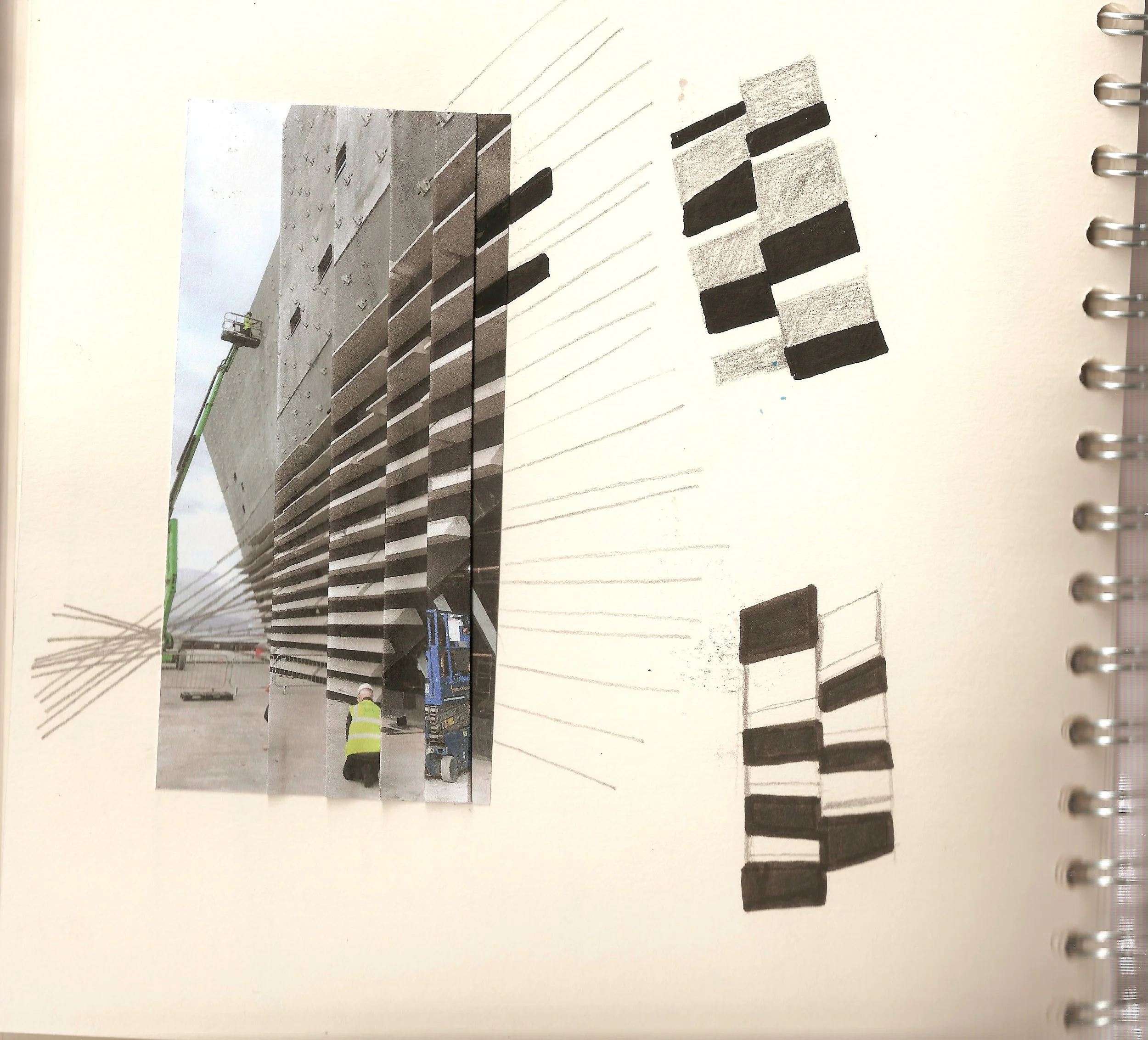
Tay started when there was a call out to create designs for penguin statues in Dundee. Studying in Dundee and loving being there I decided to pop my hat in the ring. I started researching structures that made me think of Dundee, I ended up focusing on the rail bridge, road bridge, and the new V&A Dundee (it’s turning 5 years old this month!).
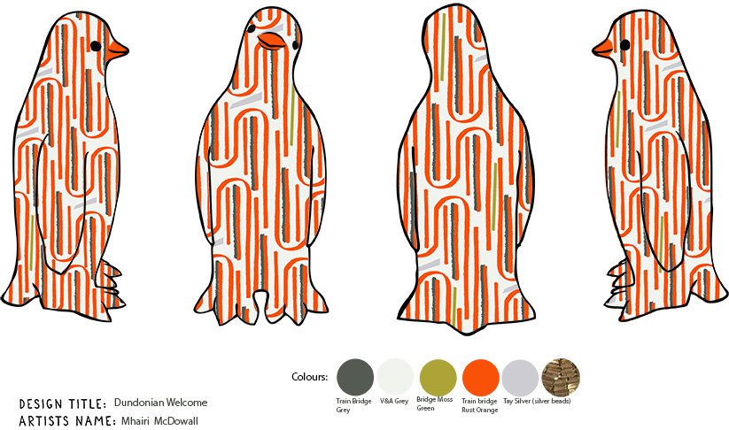
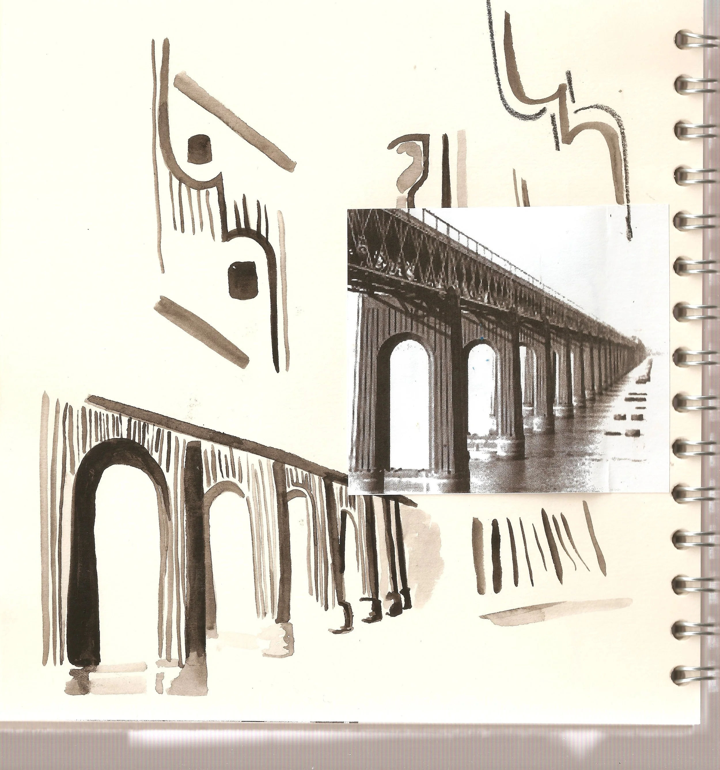
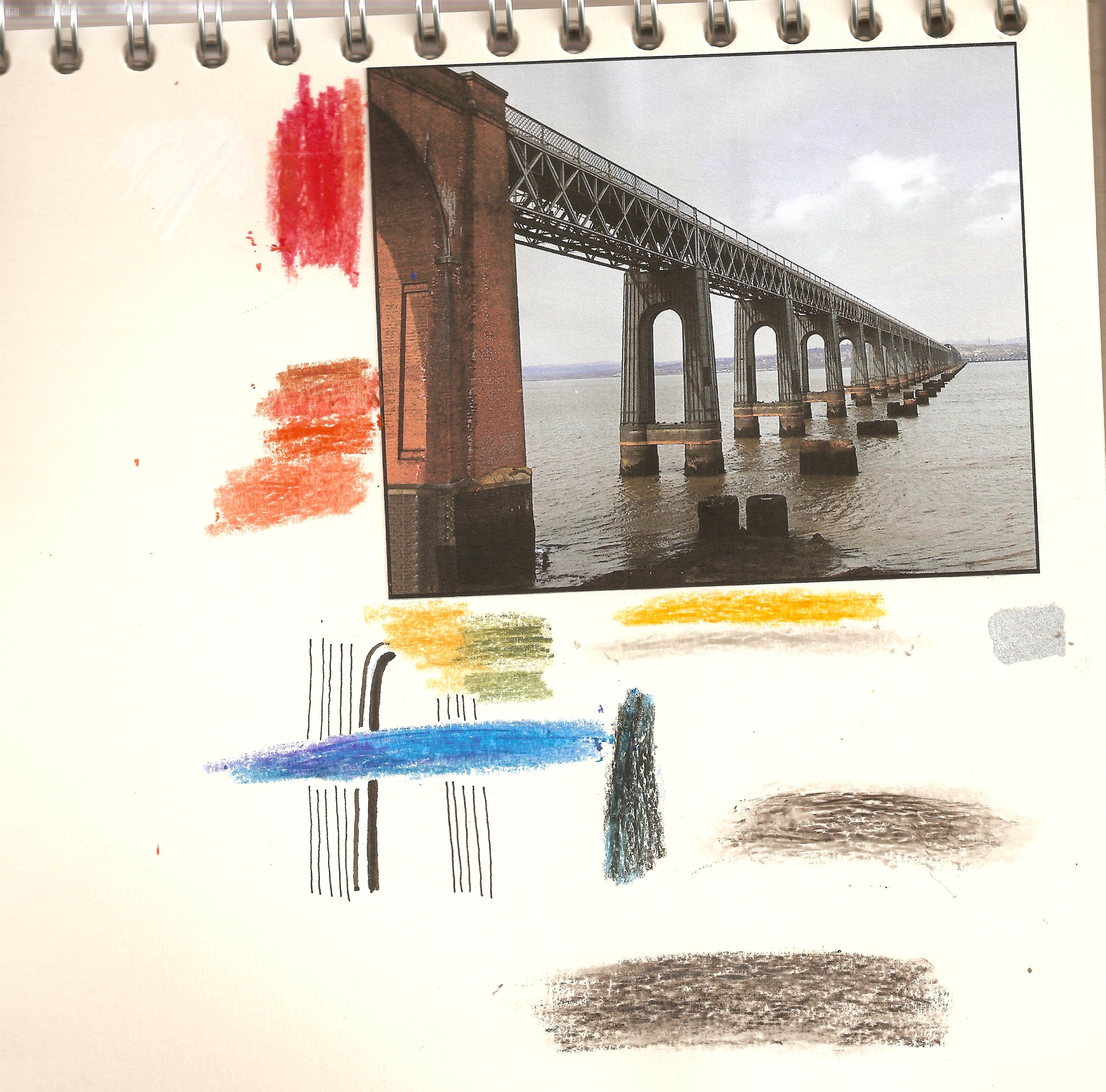
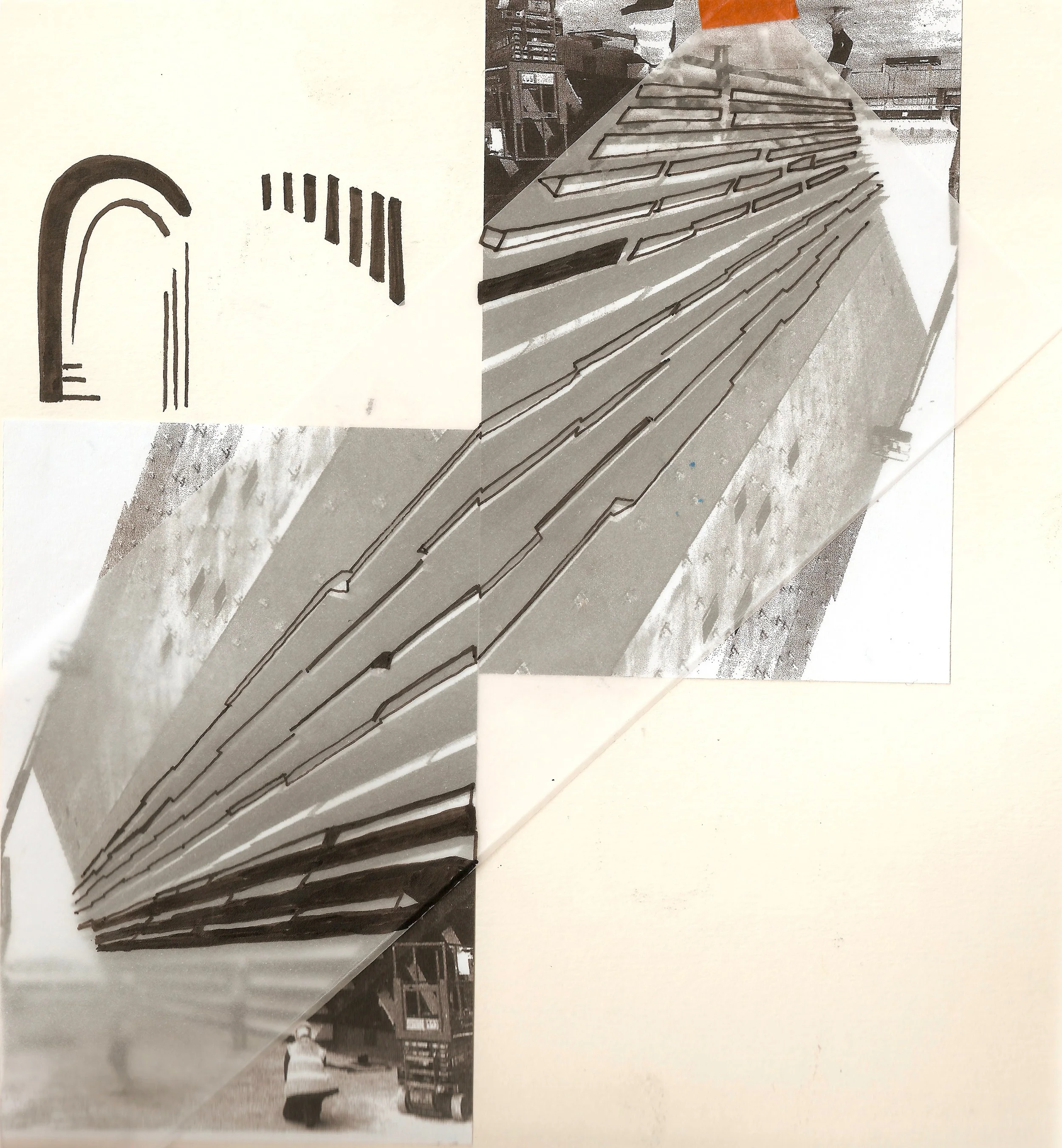
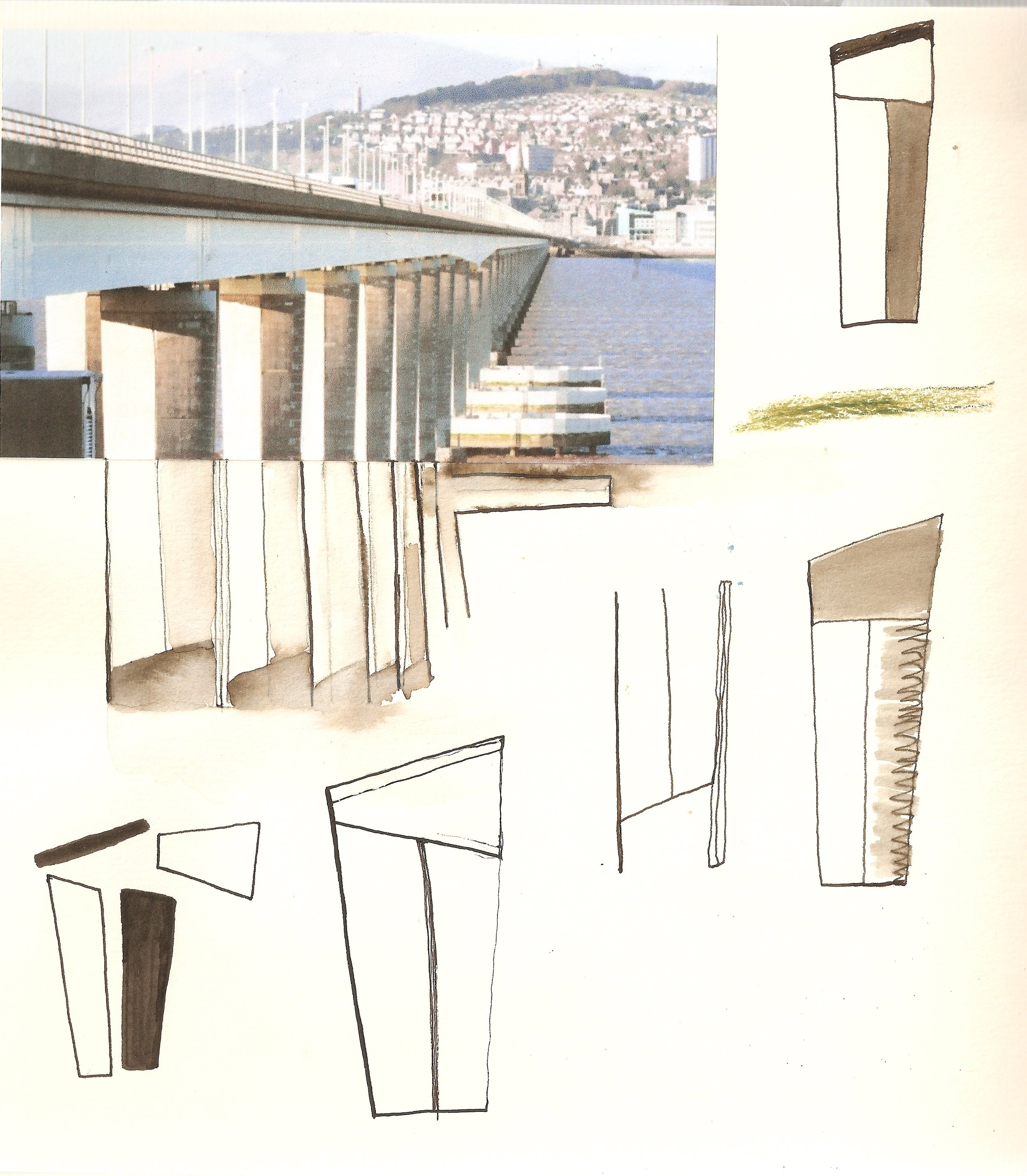
The design ideas didn’t get picked for the penguins but it turns out that was a good thing. It meant that I could go back and revisit the pattern inspired by the Tay rail bridge and resolve it. In 1879 the original Tay rail bridge collapsed in a storm due to not being of sound design to withstand such elements. Sadly everyone on board died in this accident. Work was soon started on a new, stronger, well-designed Tay bridge. I remember talking to a Dundonian about this, when at art college, and she said that the new design with the arch shape was very important in the making of the new bridge.

Image from Leisure and Culture Dundee - New Tay rail bridge being build next to the old one.
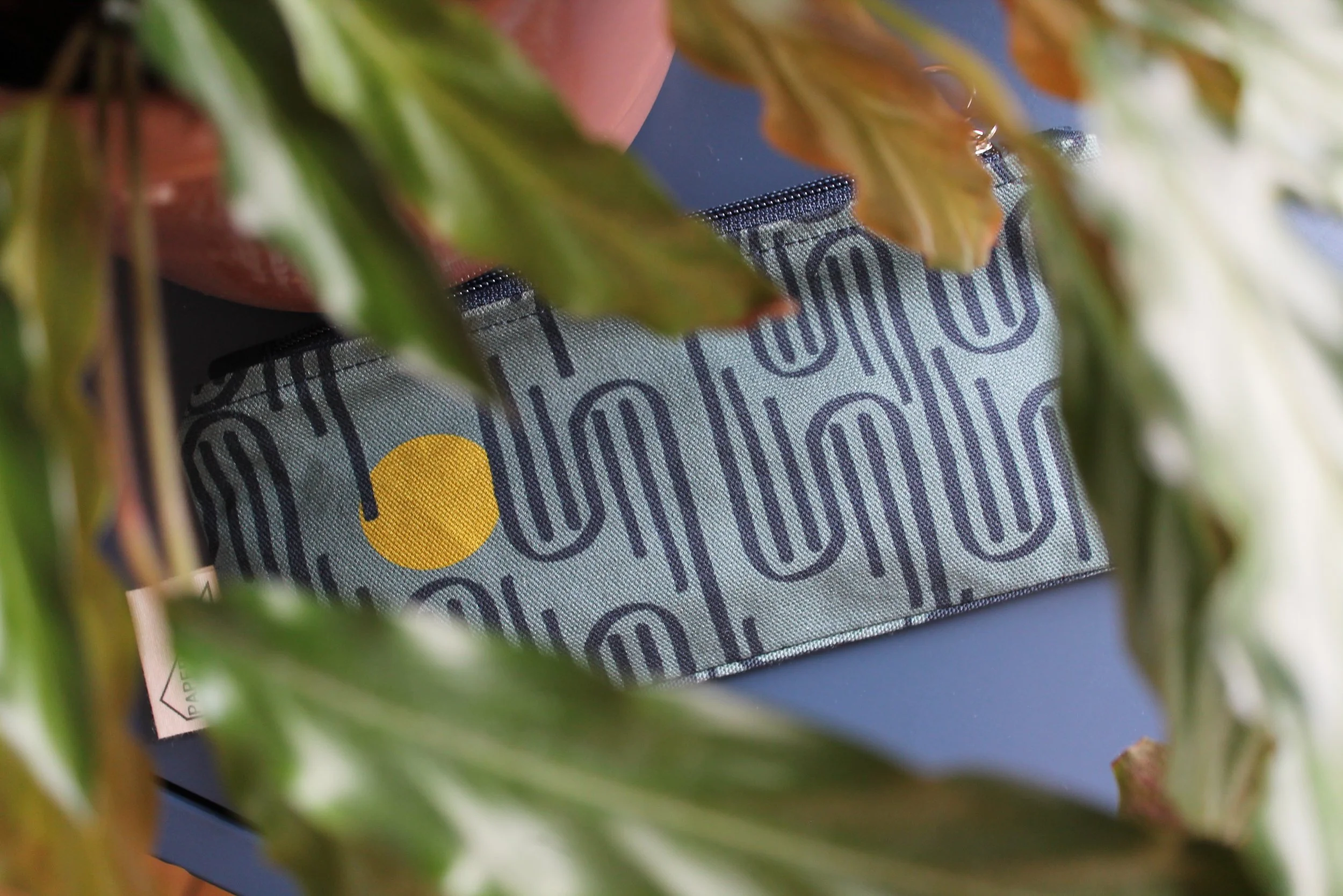
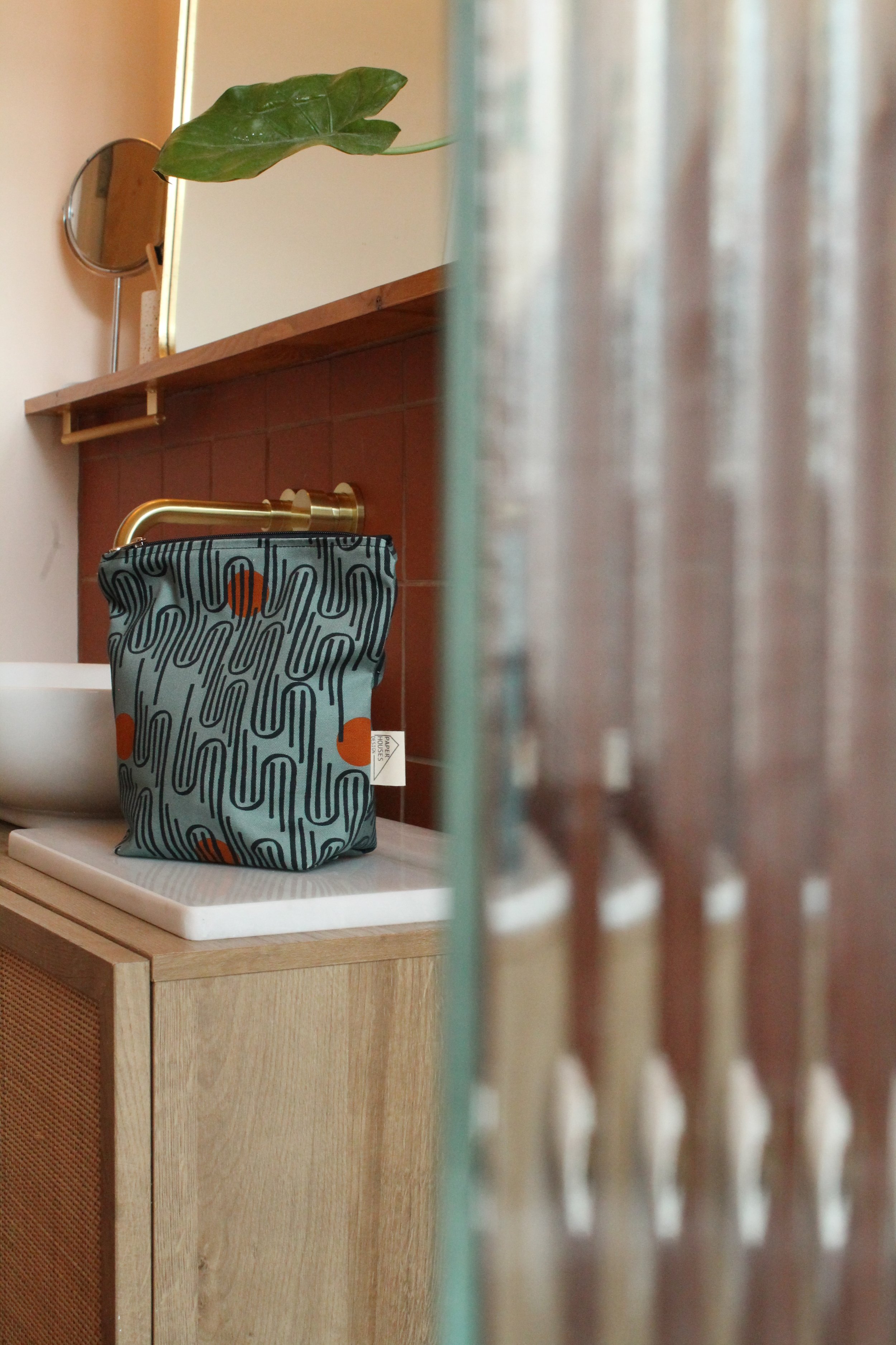
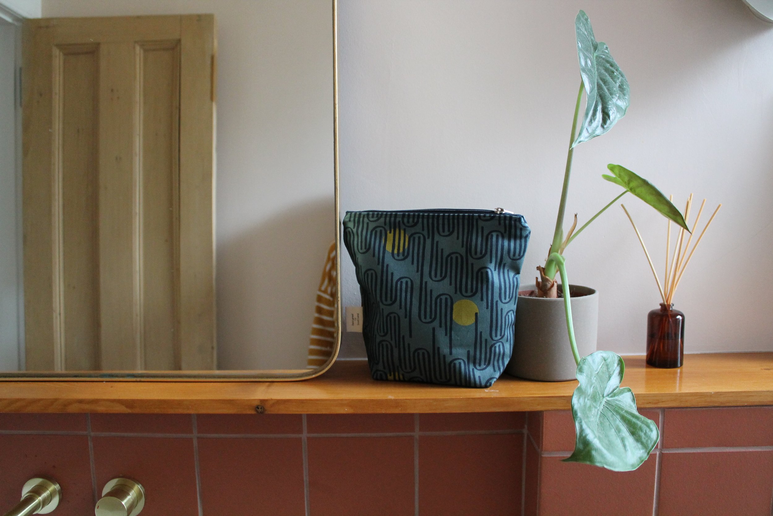
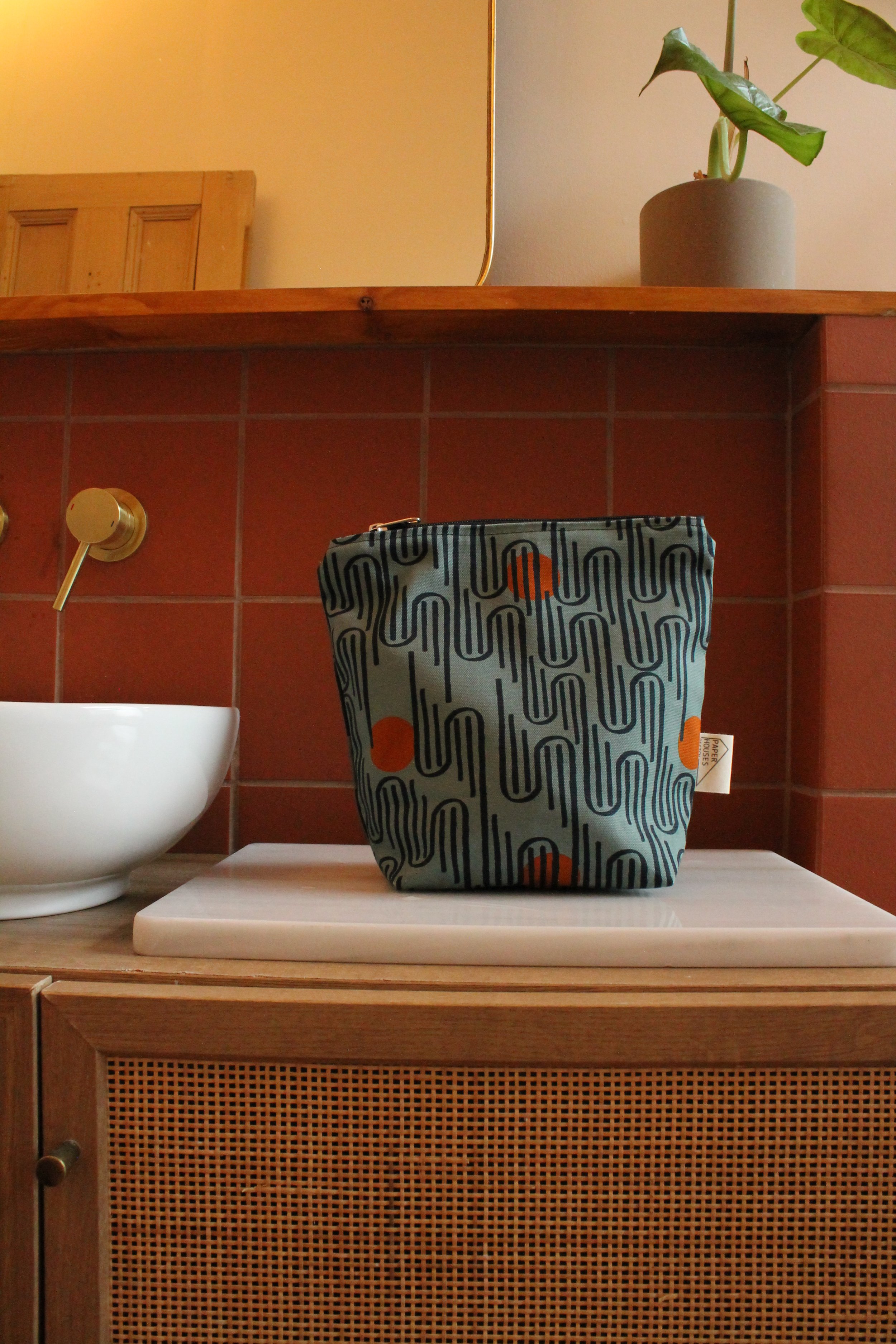
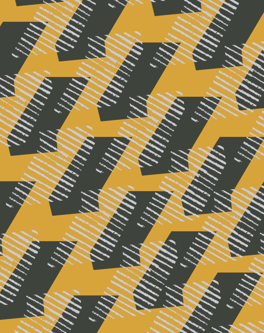
TAY - Marmalade
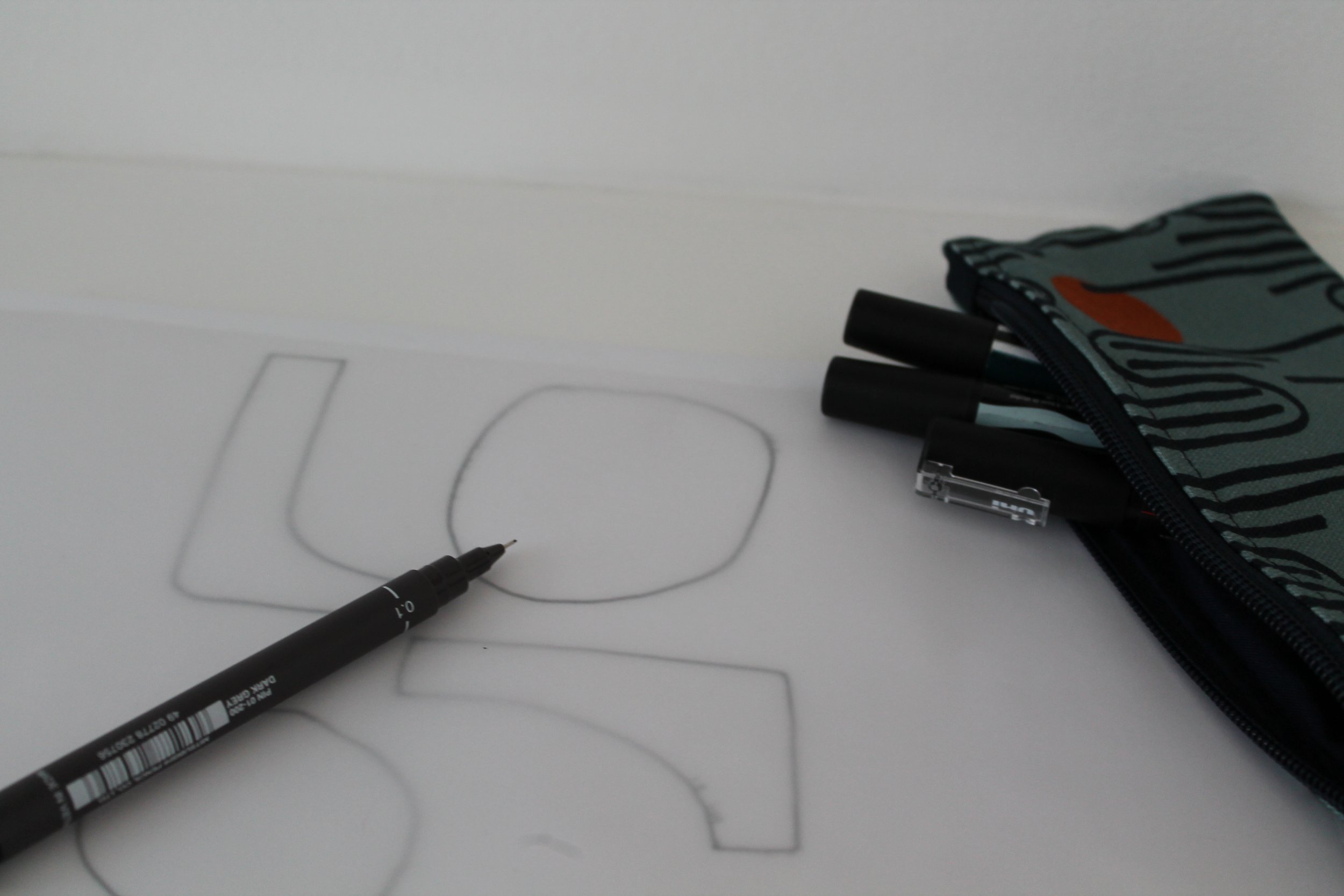
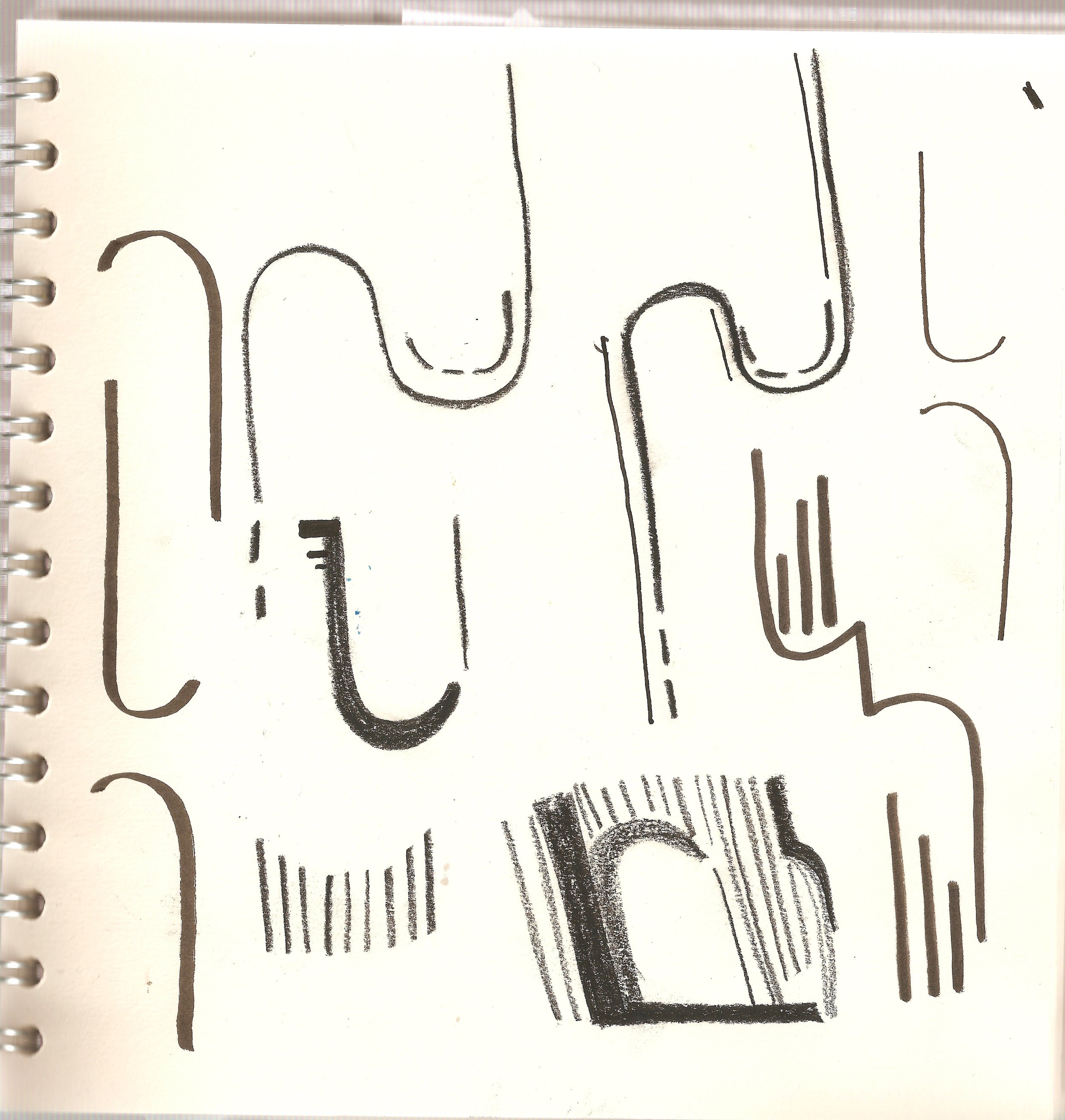
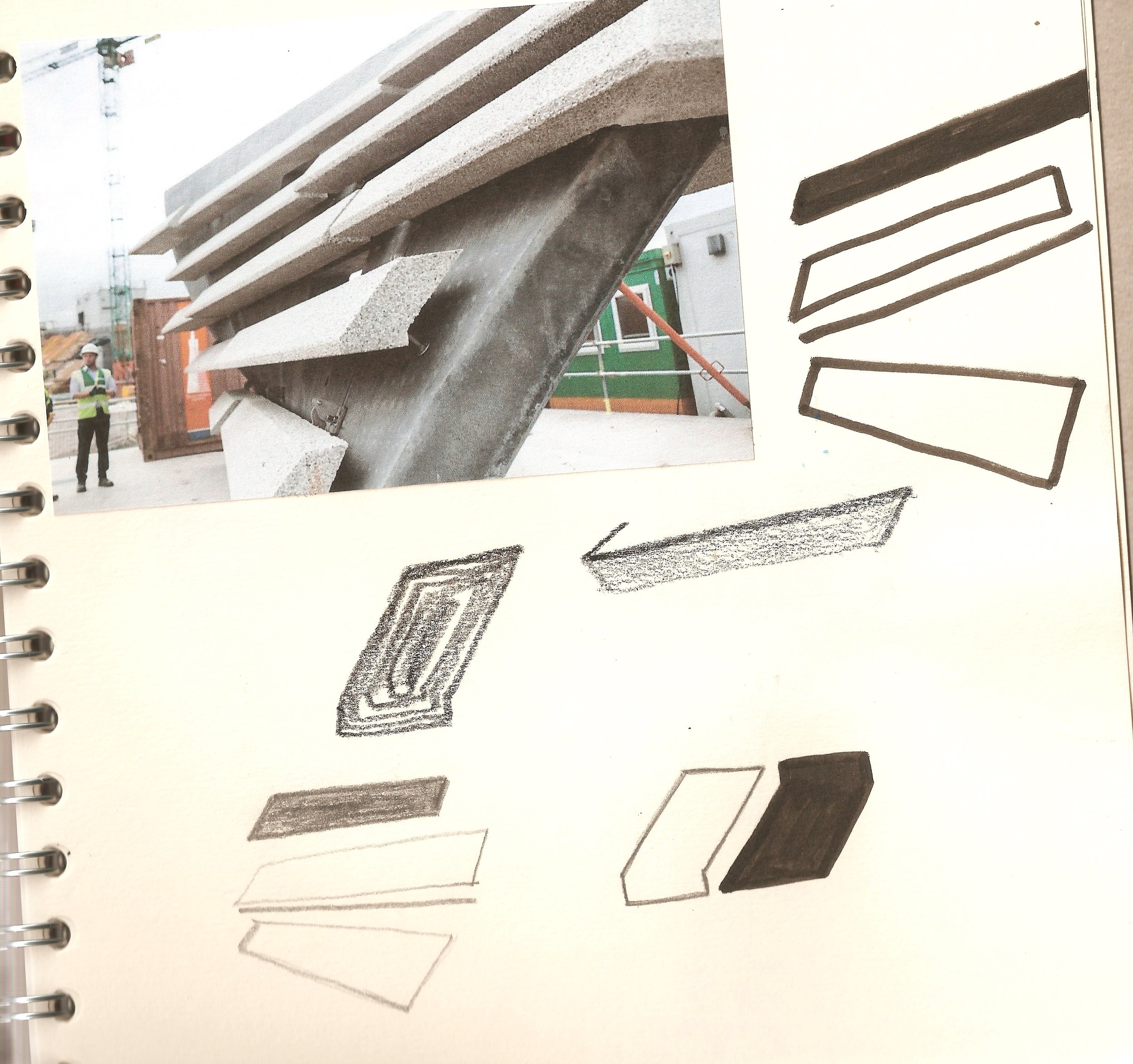
When creating my pattern I wanted to symbolise the importance of the arch. This is how I came to the double wave originally and the lines came from the connections on the steel on the legs. When I went back to this design there was a lot to do. First of all, I had to make it into a repeat print. Lines into a repeat are tricky but wavy lines into a repeat are headache central. However, there was something very satisfying when I was able to crack it!
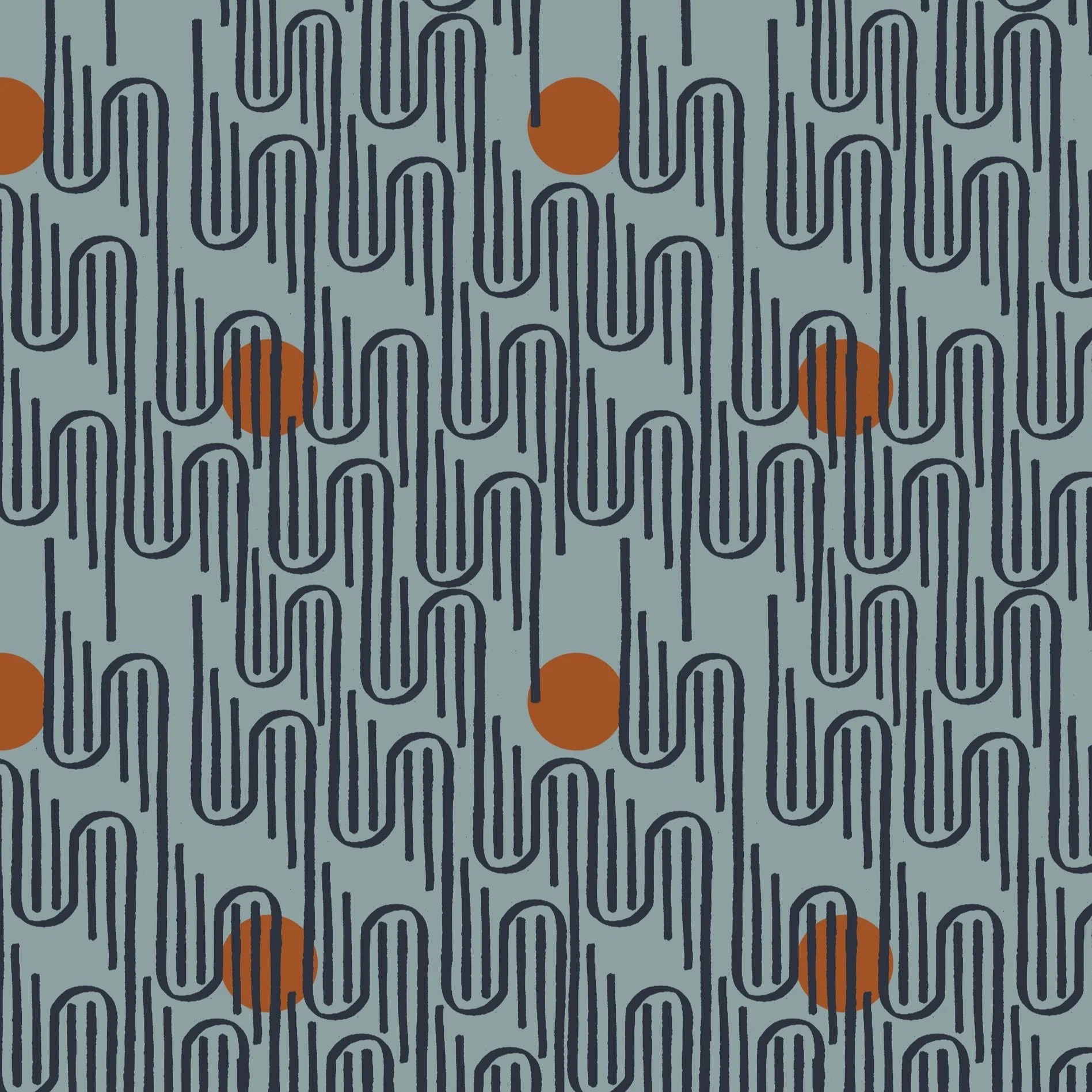
I went back to some of the original colour choices to create a more harmonious palette for the design. However because I do love a pop of colour I’ve added an orange on the Marmalade design (a nod to Dundee’s industry past) and on the other design, Lichen, a pop of yellowy/green. There’s a subtle difference in the greens too, with the Lichen design having a darker background. This is to keep the connection between the colours harmonious.

TAY - Lichen
As always, the lining of the cases is in beautiful organic navy cotton. However, in this new collection, I've made a conscious shift towards sustainability by opting for cotton labels across all products. By choosing cotton labels, I’m taking a further step towards reducing my environmental footprint when creating. Cotton is a versatile and biodegradable material, which aligns with my commitment to eco-friendly practices.
But that's not all; the printed outer fabric in this collection has been thoughtfully crafted on organic cotton half-panama. This decision allows me to maintain the bold designs and vibrant patterns that you've come to know and love, while also ensuring that our production methods remain sustainable and environmentally conscious. Paper Houses Design believes that sustainability is not just a trend; it's a responsibility we owe to our planet and future generations. By incorporating organic cotton and cotton labels into this collection, I aim to deliver high-quality products that align with both your style preferences and your values. I’m confident that these small changes will make a big impact on your enjoyment of our products, while also contributing to a greener and more sustainable future.
Thank you for joining me on this exciting journey towards a more eco-conscious lifestyle. Together, we can make a difference, one design at a time.